Is your website winning the battle for customer confidence?
 By Rob Thurner (@Robthurner) is Lead trainer for Google Digital Academy,London and Managing partner at Burn The Sky
The pollsters have got it wrong this year, in spectacular fashion. On both sides of the Atlantic. Either they were talking to the wrong people, or they were picking up the wrong signals about voters’ real intent in the Brexit referendum and US presidential election.
Let’s replace political constituents with your business’s customers, and switch the ballot box with your website. How do you know what your customers really think about your business, and how you rank against the competition?
We can took at the tell tale signs of brand favourability studies, run focus groups, and keep an eye on social media sentiment tracking. All will provide useful benchmarks, over time, and predict purchase activity. But the hard reality of what customers think is their online behaviour, measured with keyboard clicks and touchscreen taps.
Here are three quick questions to see how you’re measuring up. Try these out when you’re taking your next coffee break.
Q1. How many seconds?
I’m hoping you’re heading out of the office for a breather. I’m also hoping you’re off the WiFi network, and browsing on 3G. Right, head to one of your landing pages, and see how long the page takes to load. If you’re loaded in 2 seconds, you’re in good shape. 47% of mobile users expect web pages on mobile load in 2 seconds.
If you’re still waiting for the page to load after 3 seconds you can expect 40% of customers to abandon your site, and start shopping elsewhere. Only 3 seconds!
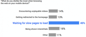
Research from Google shows that load speed is critical to winning over your mobile customers. 46% of respondents cite waiting for slow pages to load as the number 1 dislike when browsing sites on mobile.
The main culprits or slow page load time will be image and video (are you using the best compression tech?) and the number of JavaScript files (how can these be reduced?)

Q2. How many taps?
Next, get into the shoes on your customer. Complete a customer journey on your site. It could be booking a test drive, ordering a free software trial, or registering for an event. How many taps (or clicks) did that take? Mobile users tend to be high on intent to complete tasks quickly and easily, low on patience for complicated online journeys. If it’s taken more than three clicks expect some users to have quit already, and started searching for a competitor offering a path of less resistance.
This raises really important questions about site navigation, menu bars, where you place buttons taking the browser from one screen to the next, and making it clear where they are in the check out process (step 1, step 2, step 3 …)
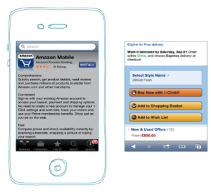
All very obvious, when you think about it, and the main reason Amazon’s in–app one click purchase is so successful.

Get back to the drawing board. Are all the steps in your journey essential? Is the navigation intuitive? Are you handholding your customer at each step in the journey?
Q3. How does your #1 competitor perform?
This one is dead easy, but may take a little longer. Repeat questions 1 and 2 for your strongest online competitors. This ‘secret shopper’ exercise is likely to reveal a few tricks you may not have considered. If they are faster, and easier, your competitors will be well positioned to win over your more demanding and fickle customers.
More traffic or more returning visitors?
We’re working with businesses ready to shift budget and resource to growing site and app traffic. This is a sound approach once the online User Experience is looking good. But I’d argue this is unlikely to be a profitable strategy where the UX is sub-standard, as reflected by Google Analytics and Sitecore tracking which shows poor goal completion and high basket abandonment rates.
Take outs
It’s obvious to digital first businesses that you may never ever meet your customer face to face, but this point may not have landed with B2C and B2C marketers which have built sticky relationships through customer-facing teams and re sellers. For those making the transition to the online world, three tips:
On-site and in-app User Experience is a key battle ground for competitive advantage – focus on delivering a quick, easy, intuitive experience with minimal clicks
Agile challenger brands can thrive and win over fickle customers without needing polished customer-facing sales teams and re-sellers
Delivering a market-leading User Experience is a never-ending challenge


 Posted On March 5 2026